Made for Motion
Frame Reformer is the first at-home pilates reformer small enough to tuck away and beautiful enough to put on display.
Branding
Product Design
UI/UX
Art Direction
My Role: Lead Designer and Art Director
Team: Megan Sherman, Project Manager + Nathan Denton, Jesse Wilbur, Project Lead + Alec Cerminaro / Whitney Jenich, UX Design + Jackie Hilmes, Research, John Mcarthy, Content + Cheri Zhou / Meijie Who, Design Interns

The Ask: Our clients came to us with the request of designing a website, product CMF, and branding for a new at-home pilates reformer. Additionally, we were also brought on to develop the UI/UX for the gamified workout screens.
The Process: Our team did a competitive analysis, user research, and stakeholder interviews to understand the market needs and gaps for a new at-home workout product. Then we developed the campaign, branding, and product to meet those needs.
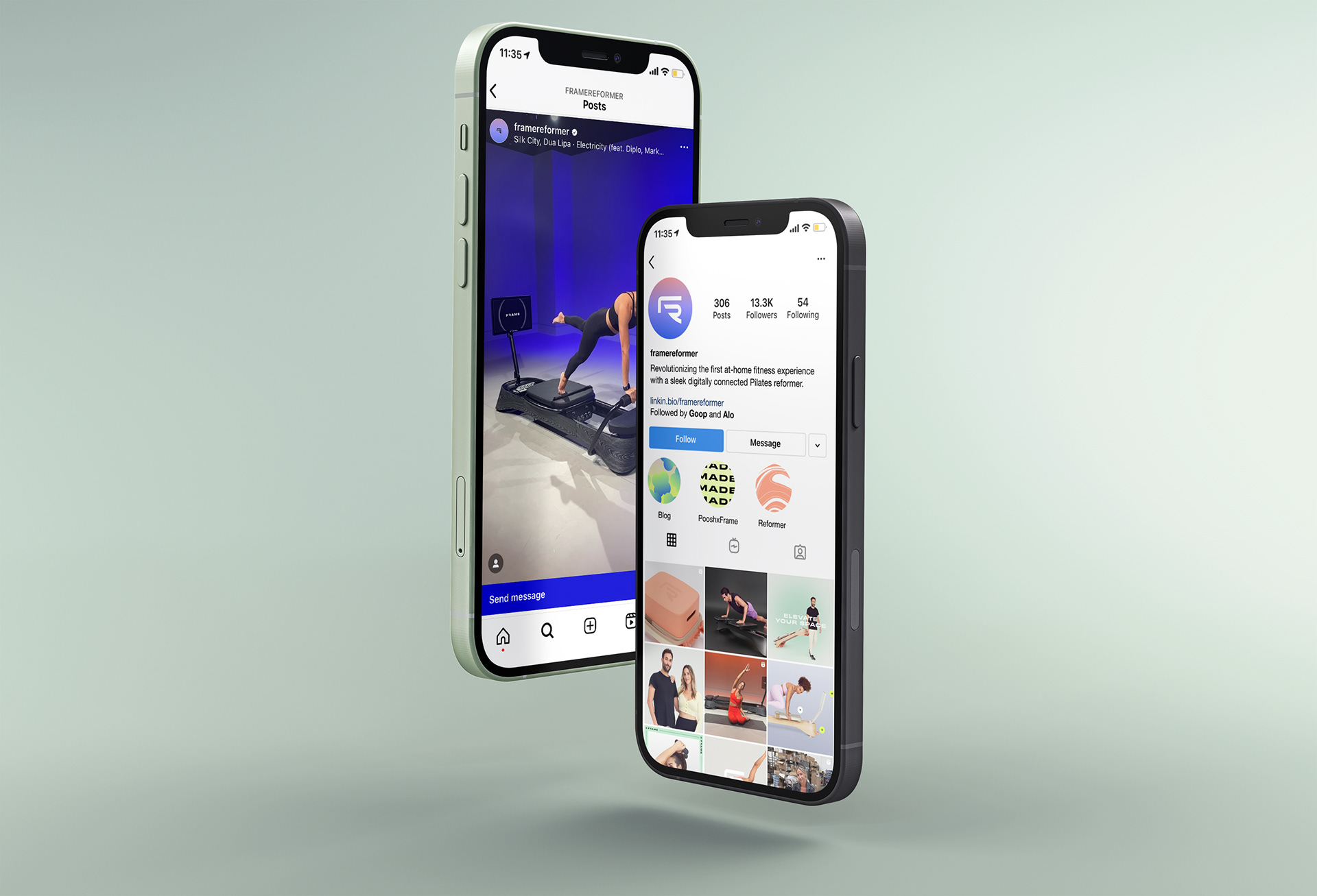
The Outcomes: Frame Reformer has been featured on Goop, Women's Health, CNBC, and Yahoo! Finance. With 71.4k followers on Instagram, it surpassed it's pre-order goals and was part of the 2022 Goop Holiday Gift Guide.
Kickoff
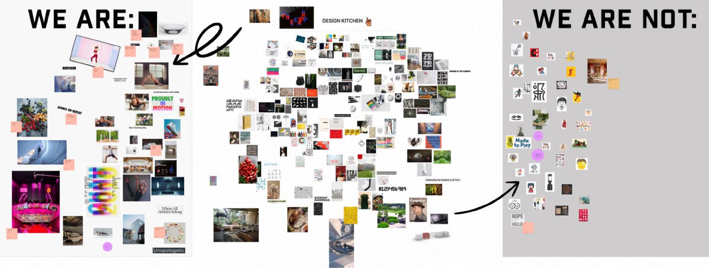
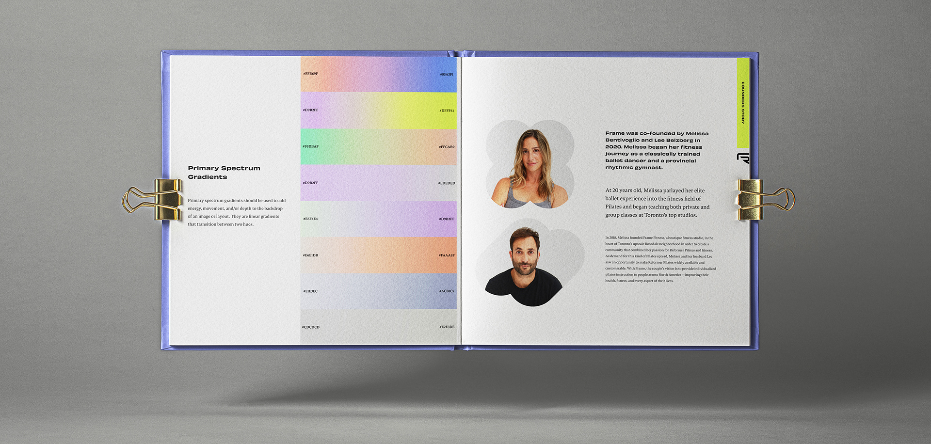
First we had a team kickoff with our clients. We brought tons of inspiration and asked them to talk about who they were and who they were not so that we could get a better understanding of what their goals were for the brand.

Research
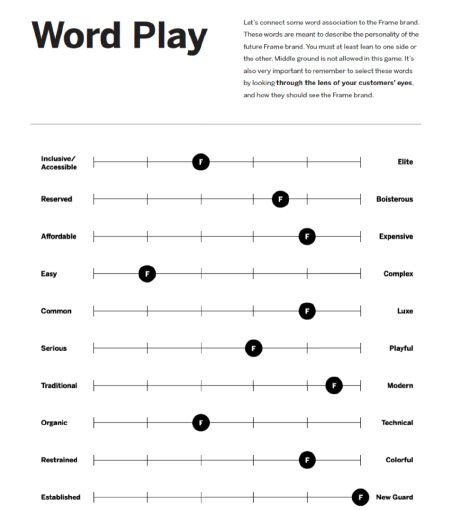
Next, we did an audit of other at home workout brands and found that many were following the Peloton aesthetic of strong dark colors, cold/serious models, and bold typography.
User Research
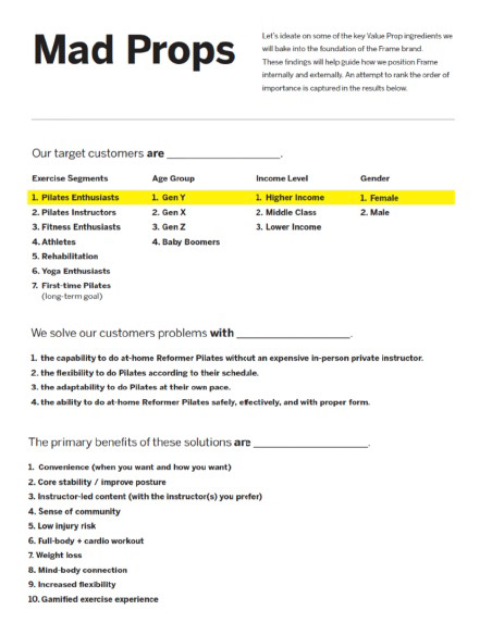
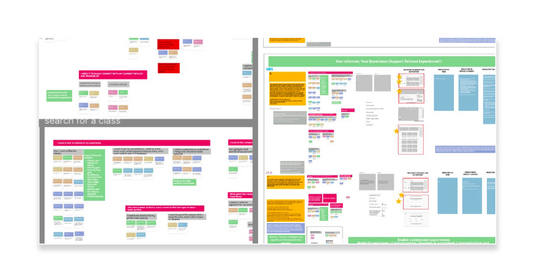
Finally, we tested our ideas and concepts on a group of users from novice to experienced to see what they were looking for in at-home workout equipment. We used this feedback to supplement our clients own research to understand who their target user was and why they would buy this product.
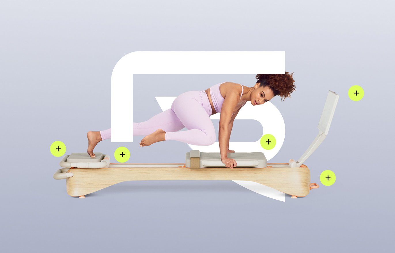
Brand
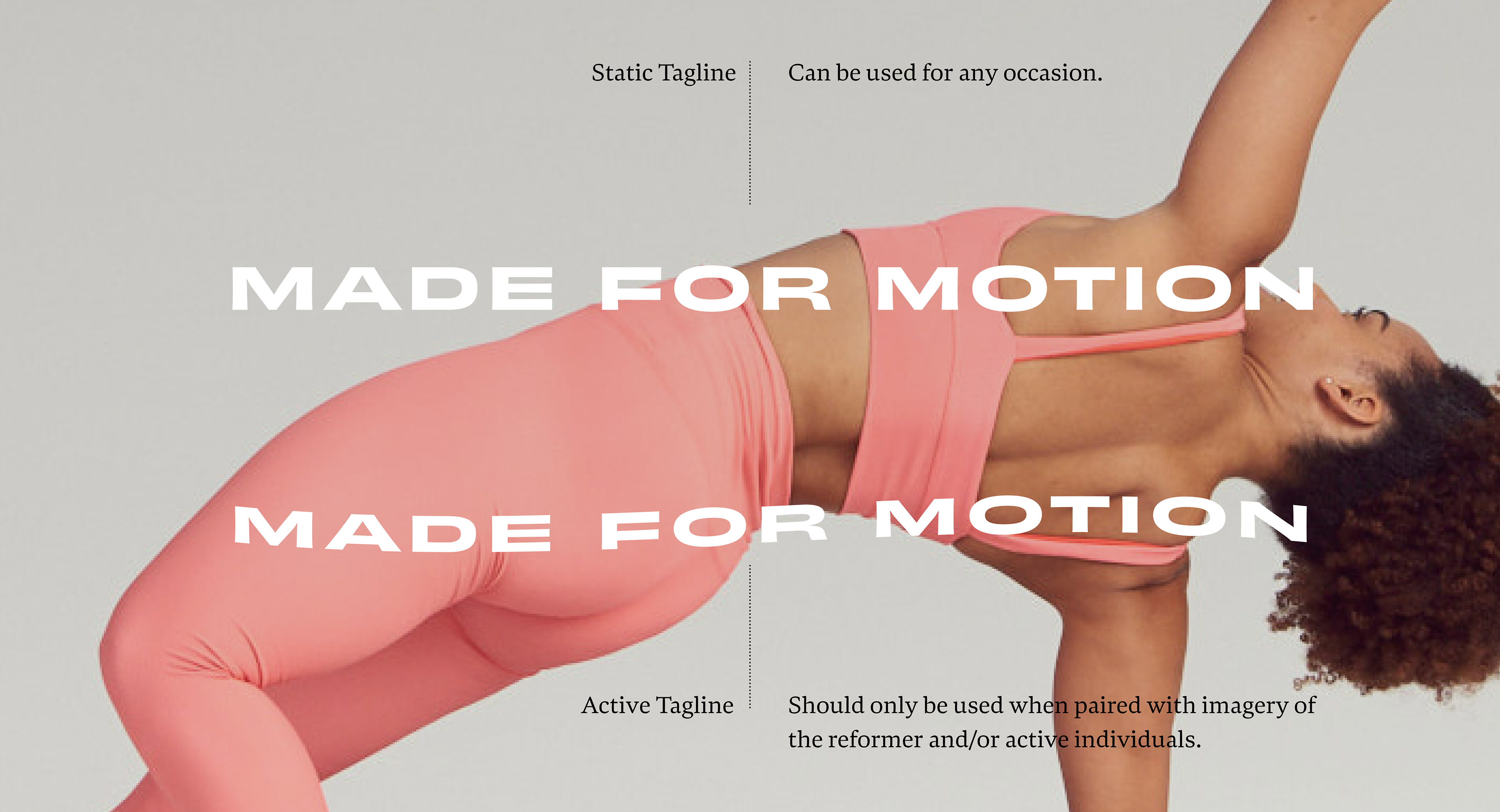
From our analysis, our goal was to develop a brand that stood out amongst competitors and was accessible to users that lived in smaller spaces like apartments and dorms. Because this brand was developed over COVID, we kept coming back to this idea that everyone is "Made for Motion" and that our bodies aren't meant to be stationary. Users didn't want to feel overwhelmed by competition. They just wanted to get back on their feet.
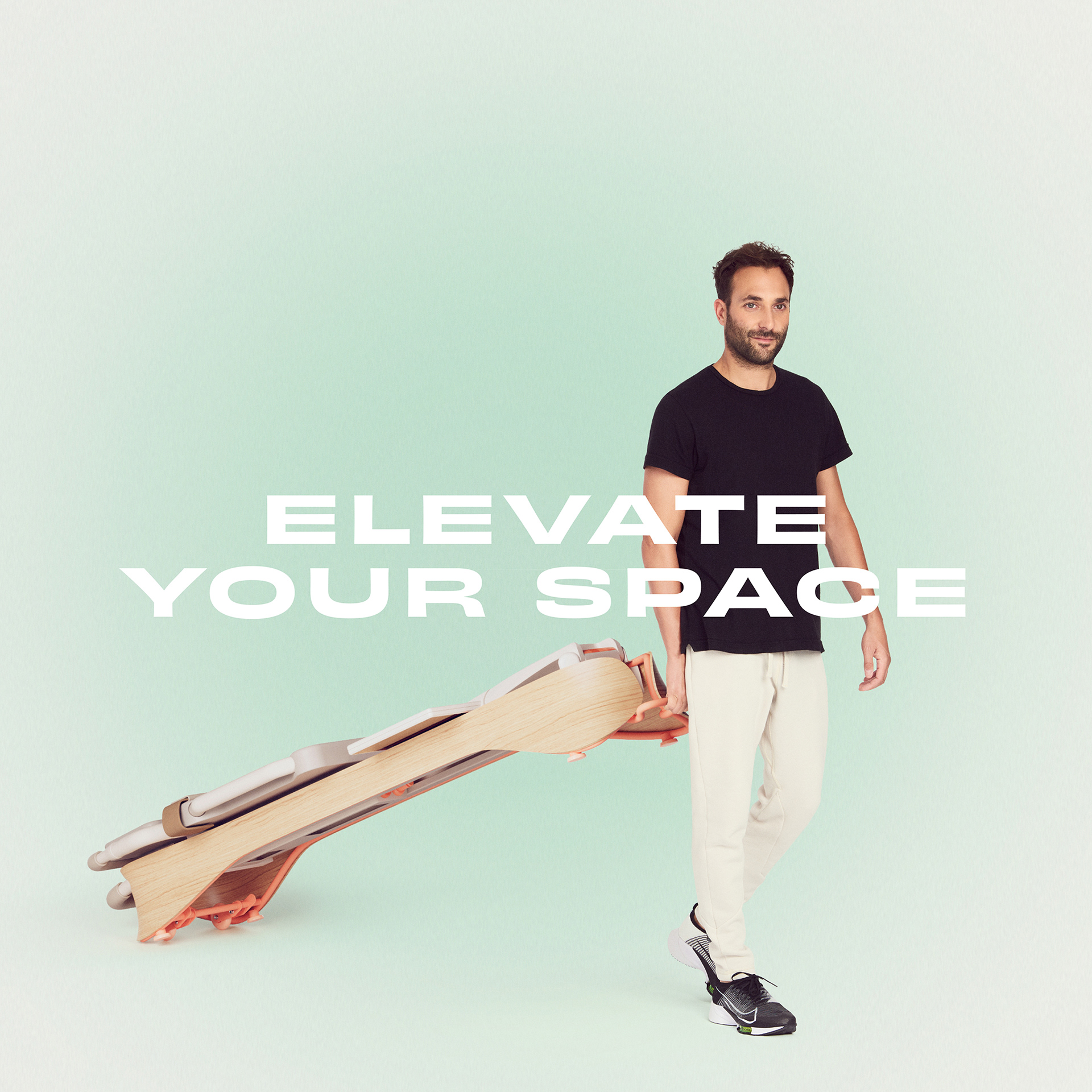
With that in mind, we decided to highlight the flexibility of the equipment—that it's good for any movement goal whether its a five minute stretch after working all day on a laptop, or a 45 minute core workout.
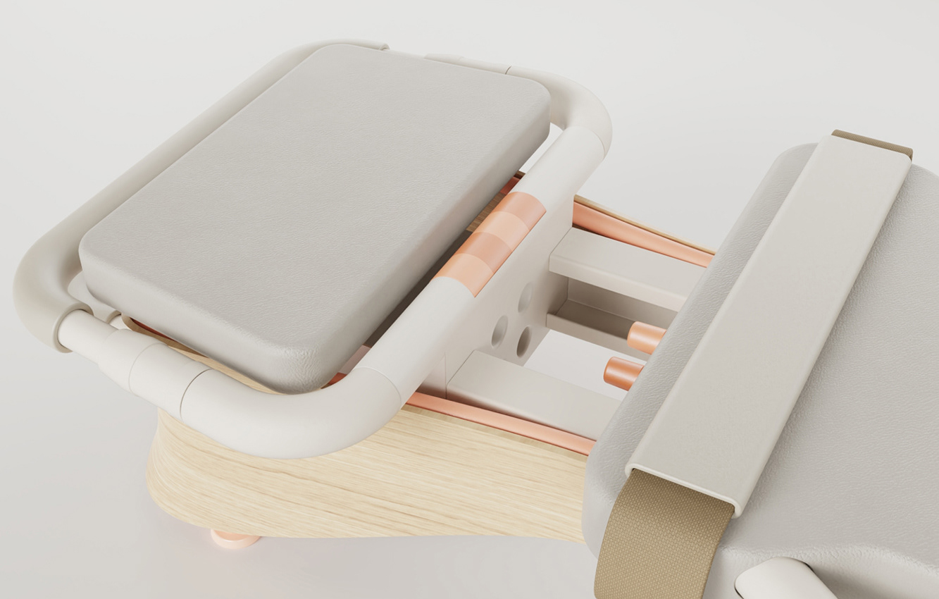
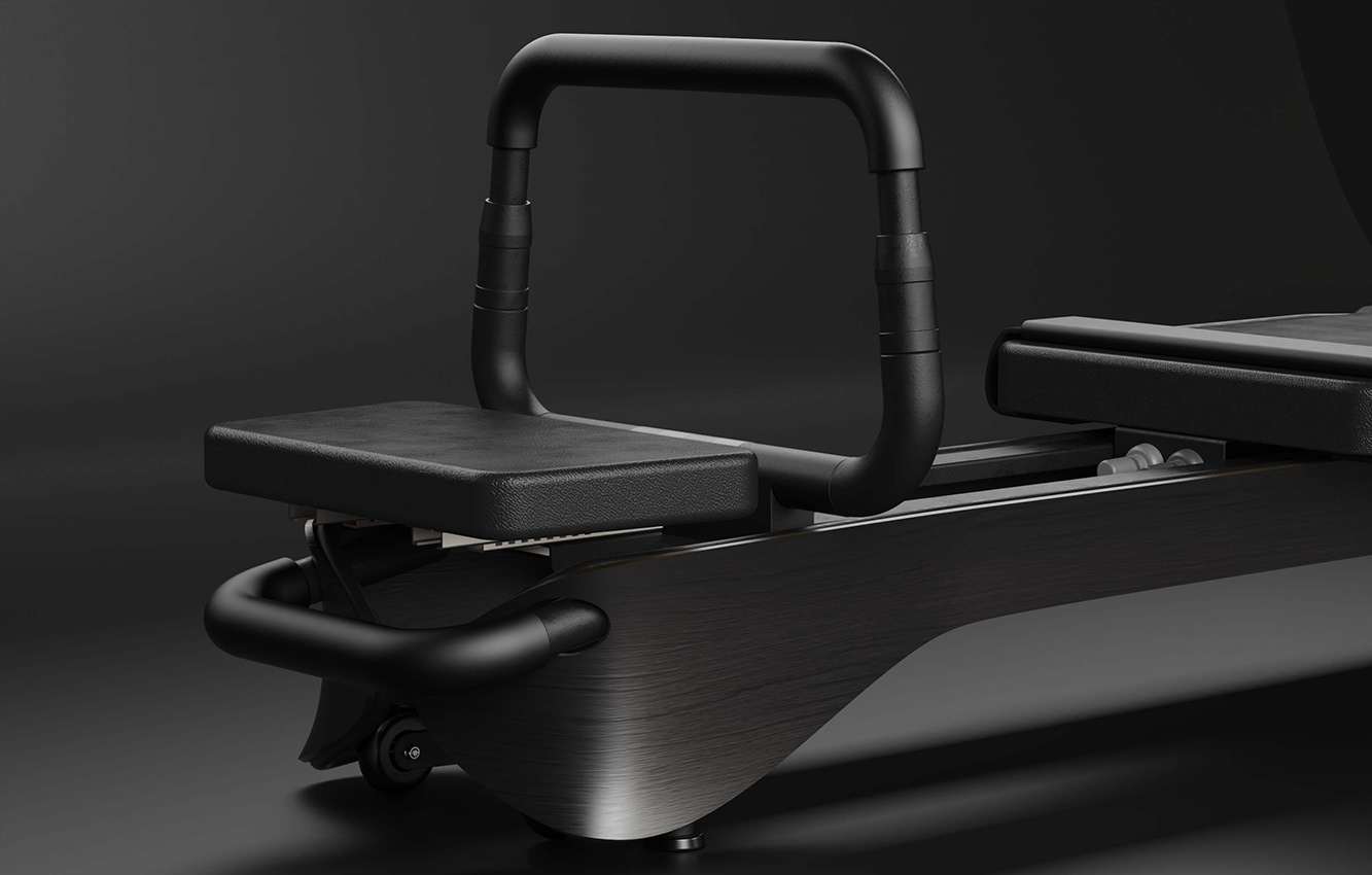
Equipment Color, Material, and Finish
I worked with an industrial designer to develop materials and colors for the two color ways of the equipment. The goal was to make it feel like a piece of classic furniture that could be proudly displayed. We wanted the product to be flexible to meet the needs of different spaces—something that young people living in city apartments who didn't have space to hide clunky, unsightly equipment could buy too. We did several iterations of color ways that would influence the direction of the brand. ID by www.wearecamp.studio
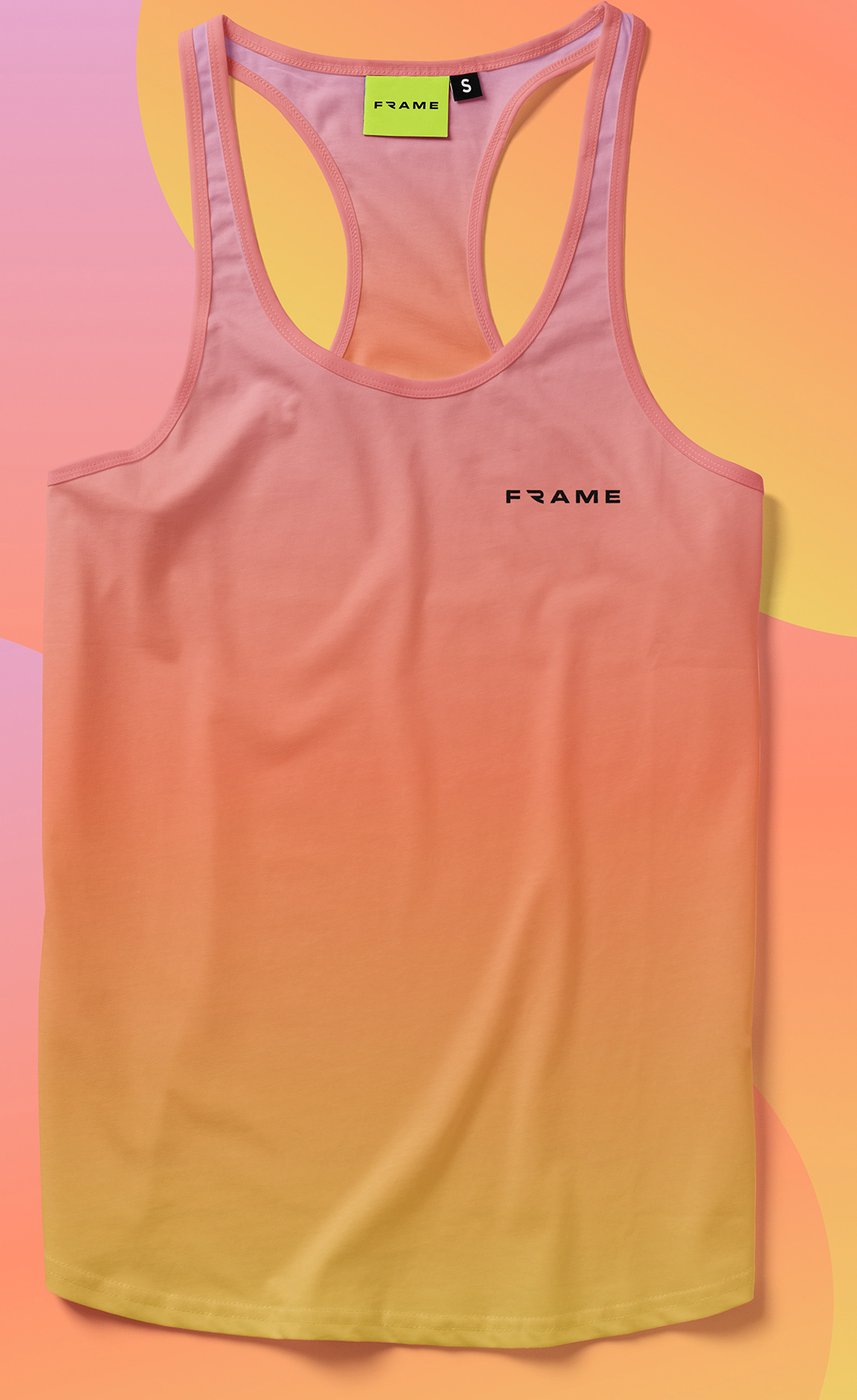
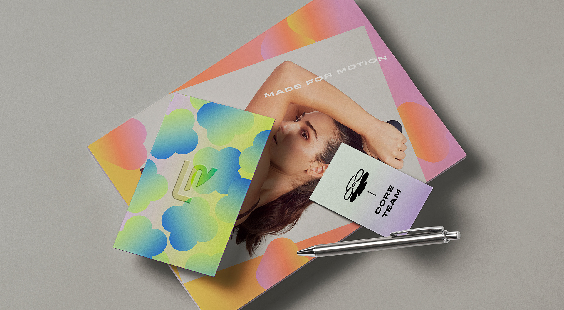
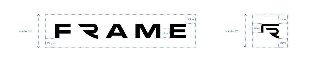
Logo
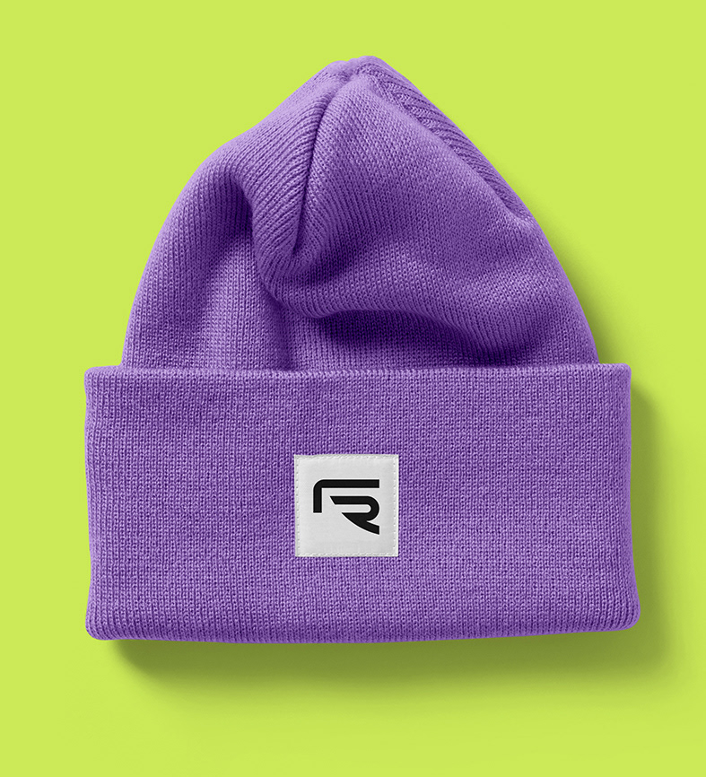
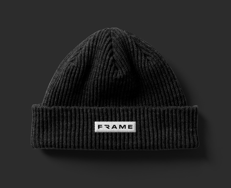
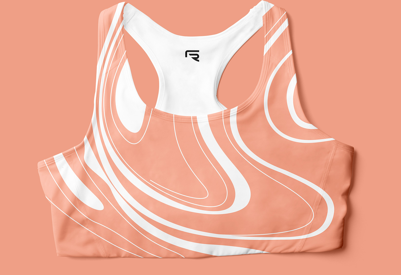
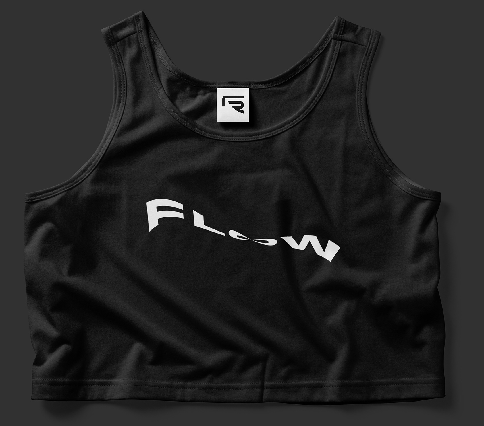
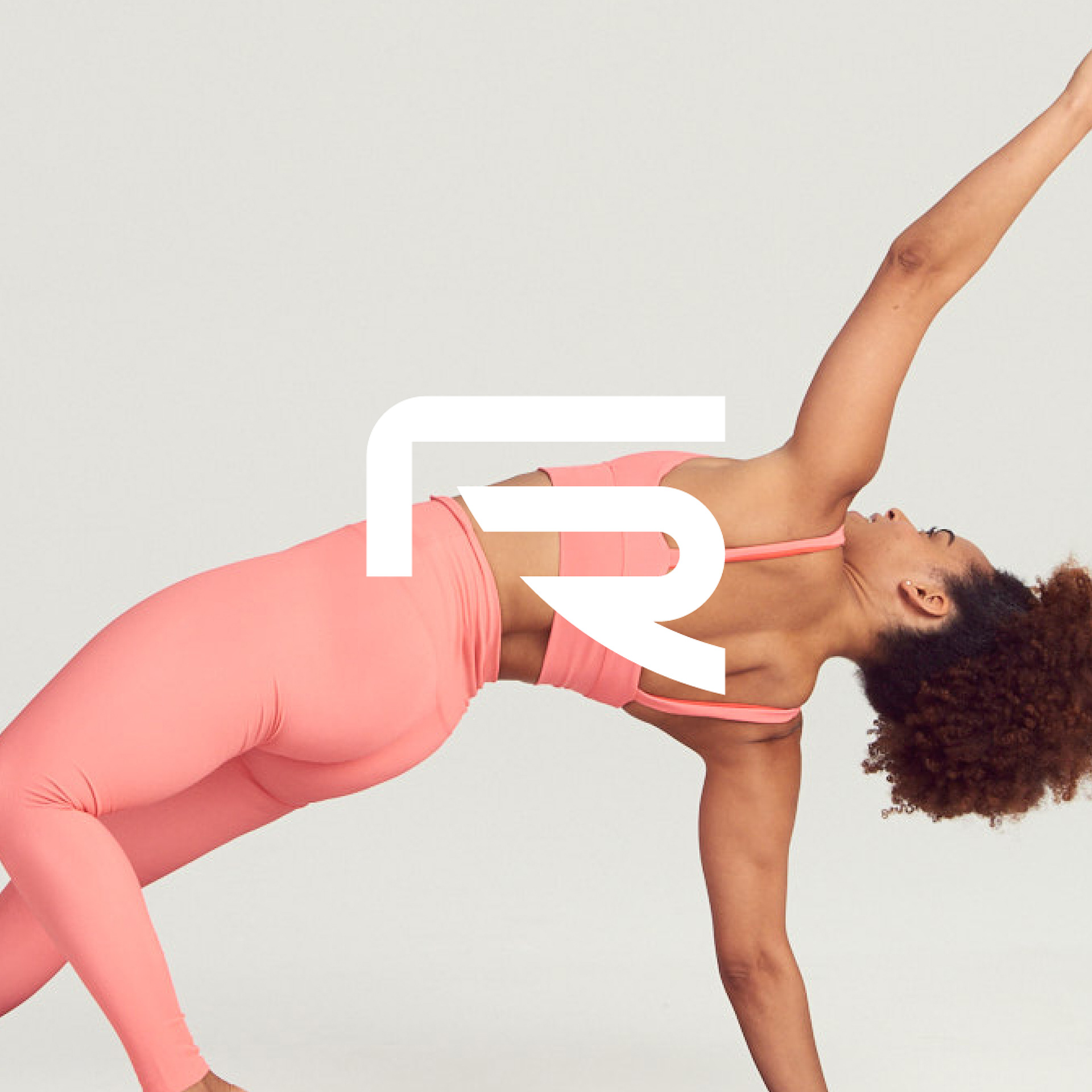
For the logo, we wanted the wordmark to be able to stand on it's own as Frame, or also be able to represent the full name of the company Frame Reformer. The F and the R in Frame come together like a sliding reformer to create the abbreviated version of the mark while also becoming a little frame to center yourself and your own physical needs. We wanted the mark to be powerful enough to stand on its own...something users would be proud to wear and represent.


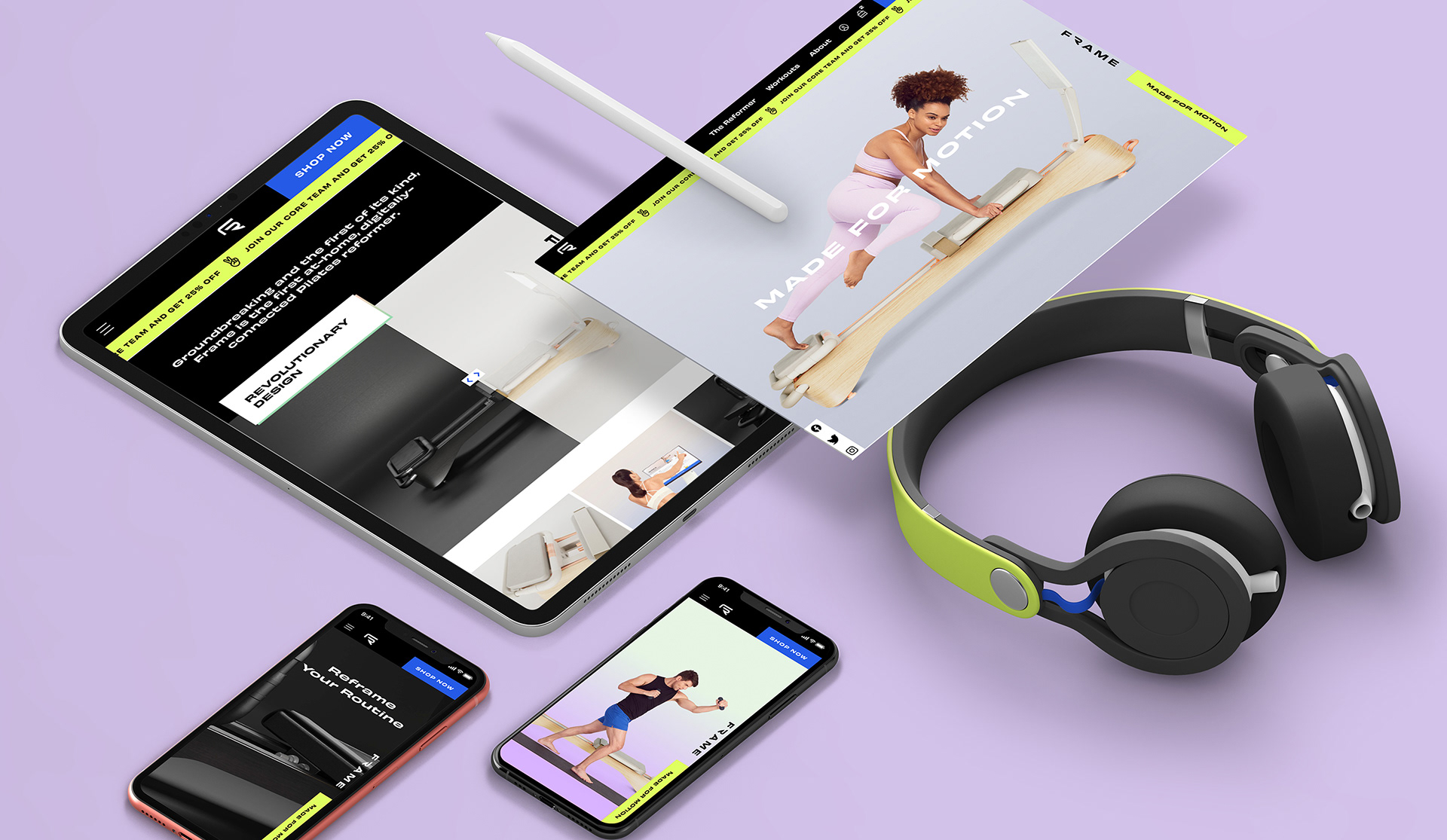
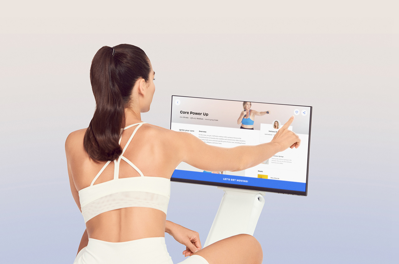
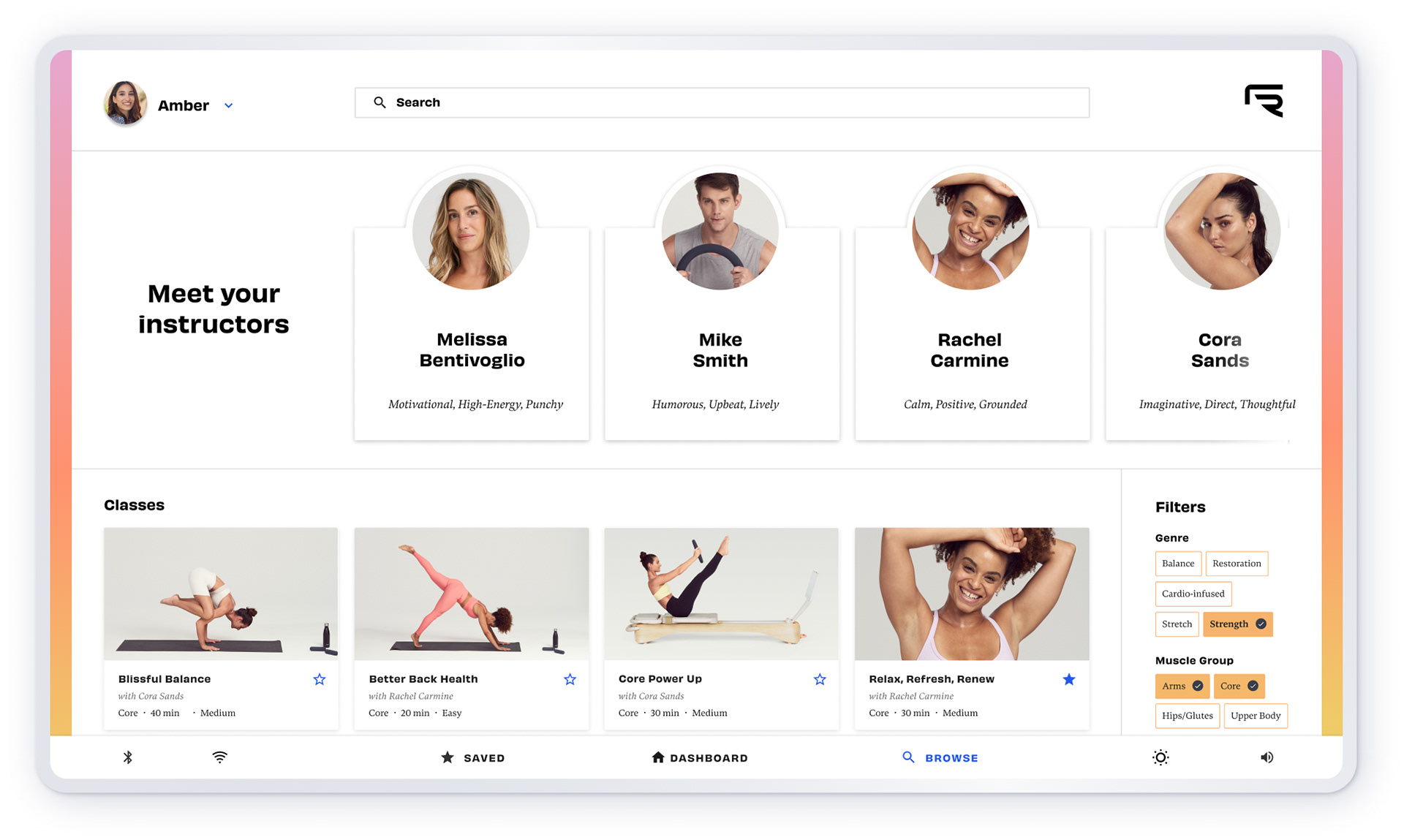
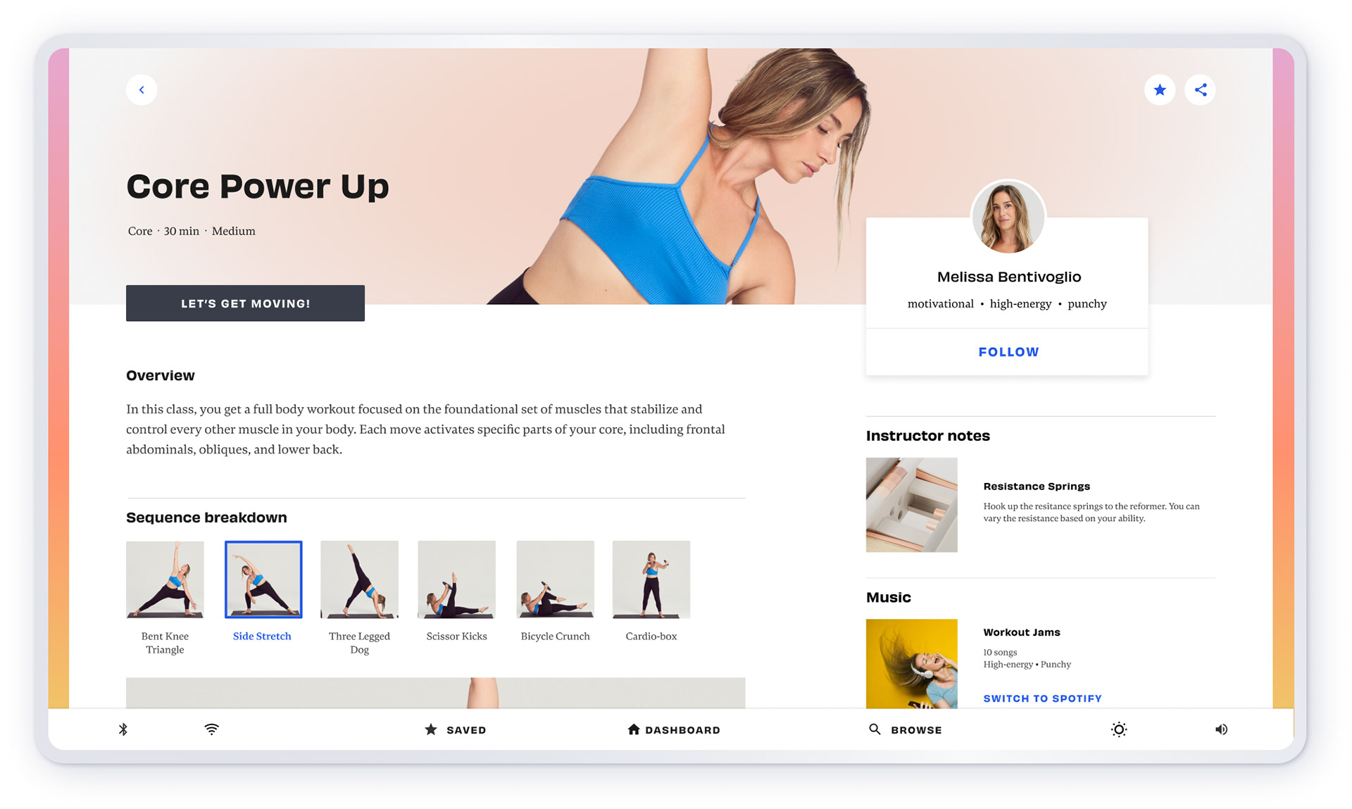
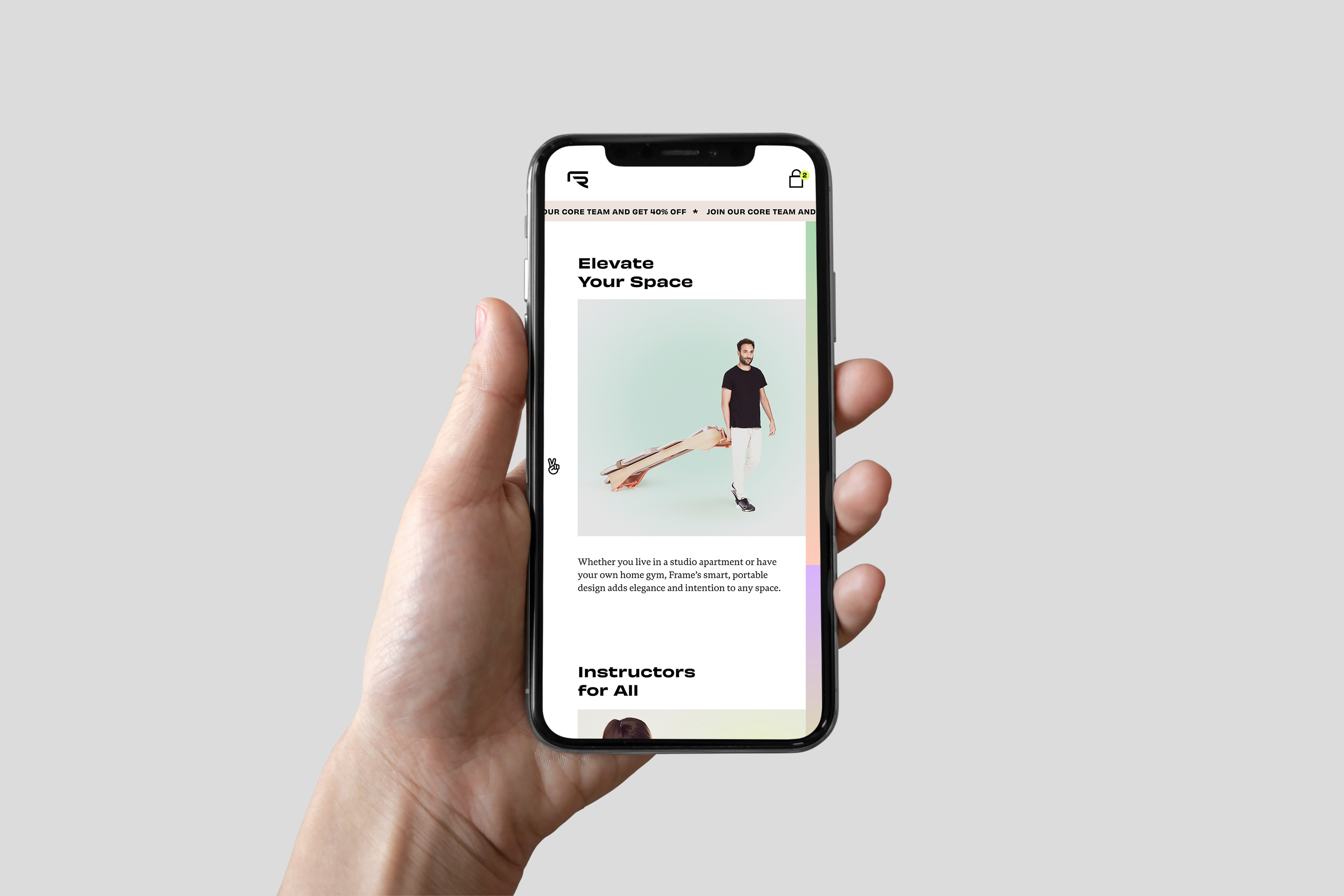
User Interface
Finally, I worked with the UX team to develop the look and feel of the ui on the workout screen. The reformer has been covered on numerous media outlets including Goop, Forbes, and Shape.
“I’m so into the intentional design that went into the Frame reformer. It’s got everything you need in a true Pilates reformer, but it’s chic enough that I’d be proud to have it in my living room. Plus the user interface of the touchscreen which has both on and off reformer glasses is gorgeous”—Kristen Geil of Shape
“I’m so into the intentional design that went into the Frame reformer. It’s got everything you need in a true Pilates reformer, but it’s chic enough that I’d be proud to have it in my living room. Plus the user interface of the touchscreen which has both on and off reformer glasses is gorgeous”—Kristen Geil of Shape

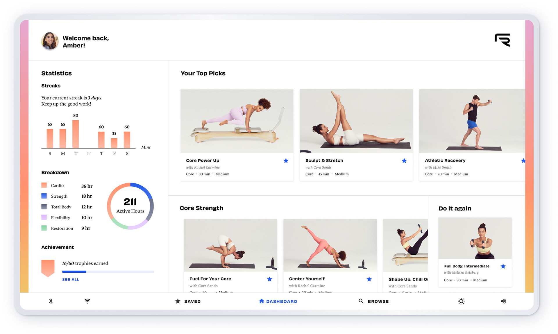
Turning the Brand into a Lifestyle
The goal of the brand was always to be more than just the reformer. Our clients wanted to develop a community and network around Frame. They created online classes, a strong social media presence, and a unique brand story. Being owned by a female CEO, we wanted users to feel proud to rep the brand and have the aesthetic be a part of their lives.
We turned the brand into a strong social media story as well that was super flexible as they added more workout videos, products, and services to the offering.

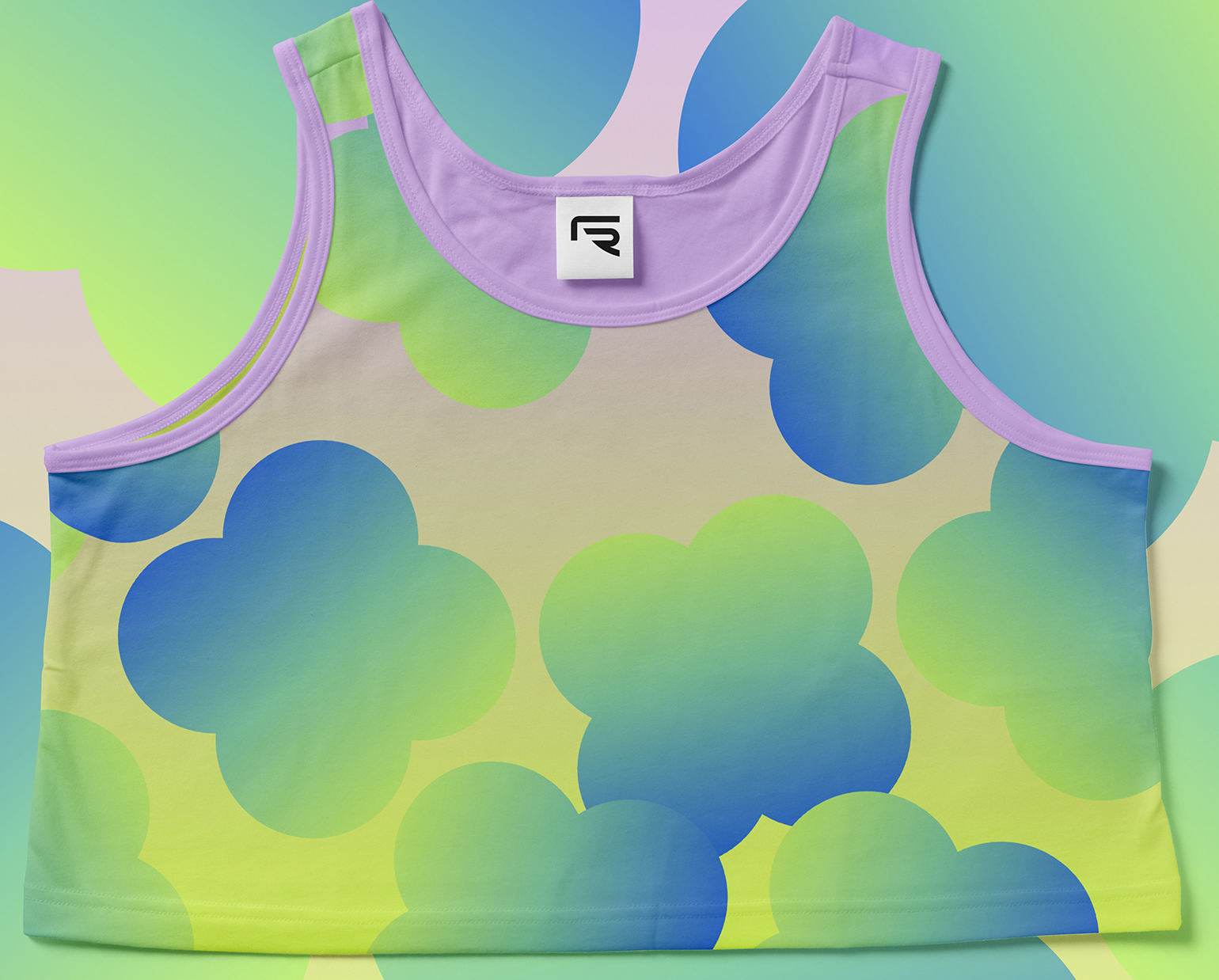
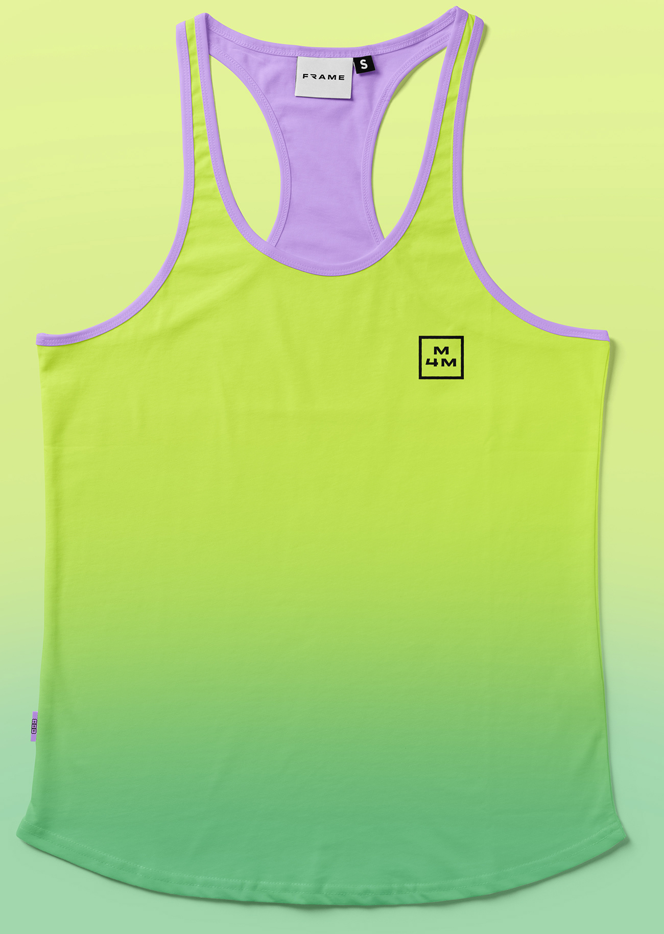
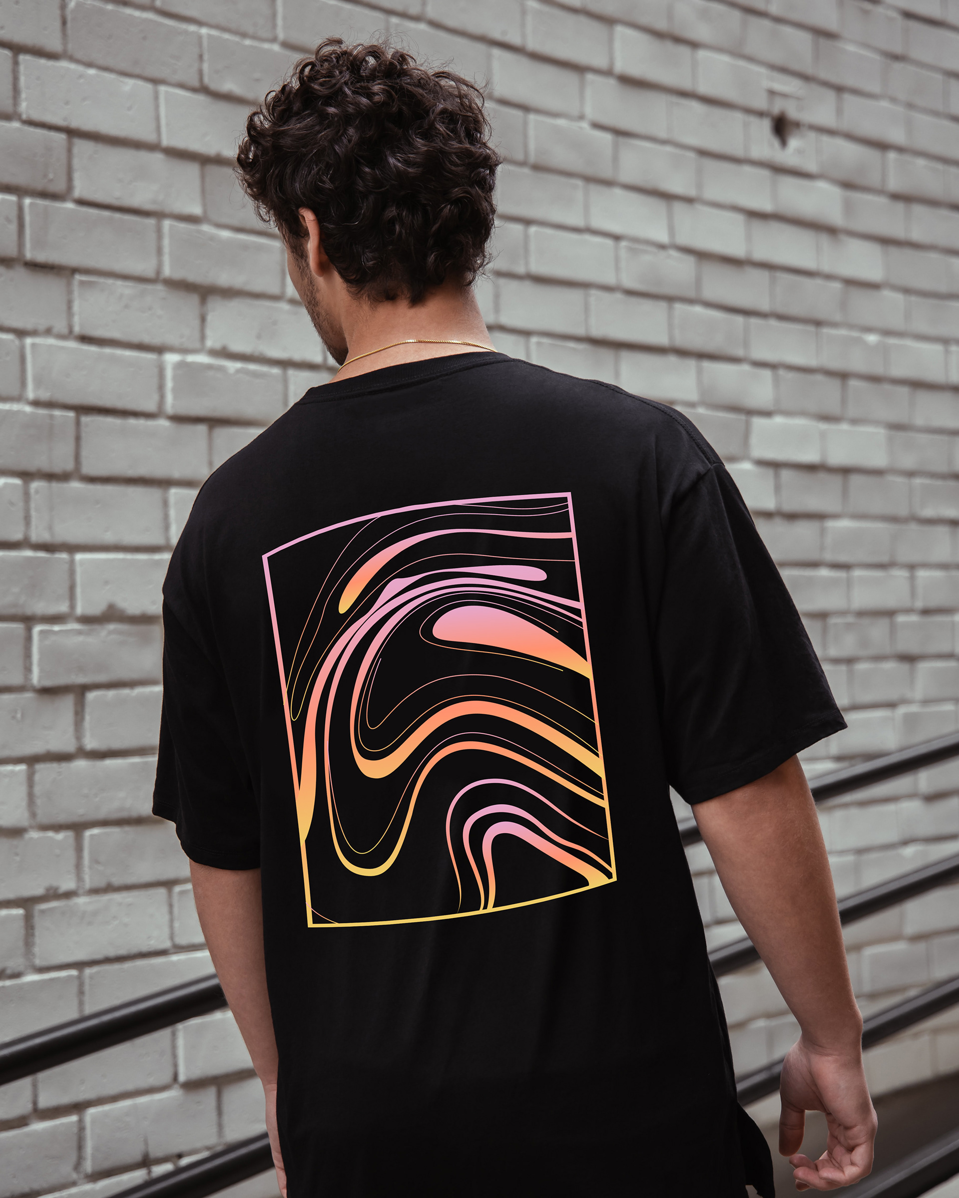
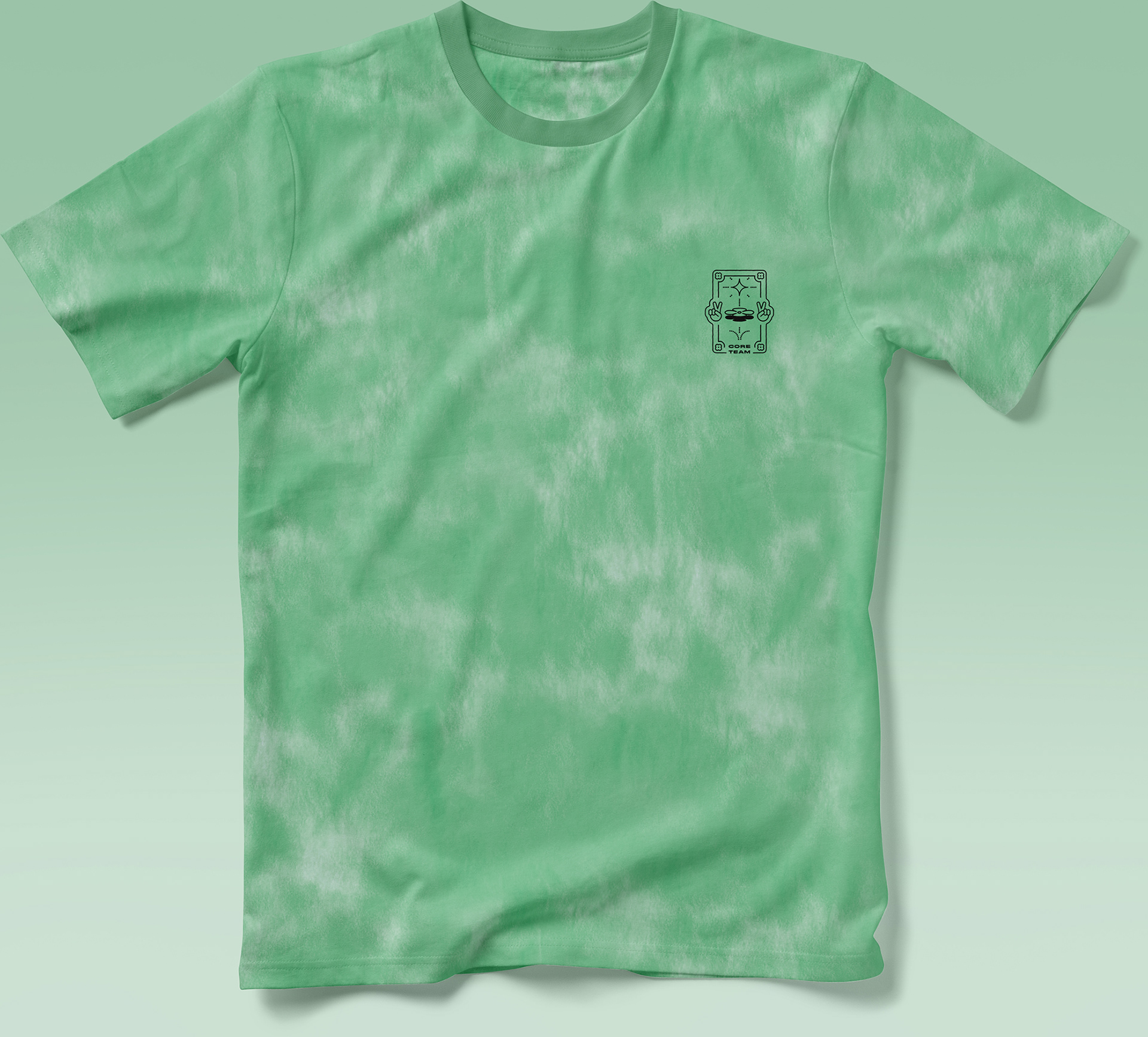
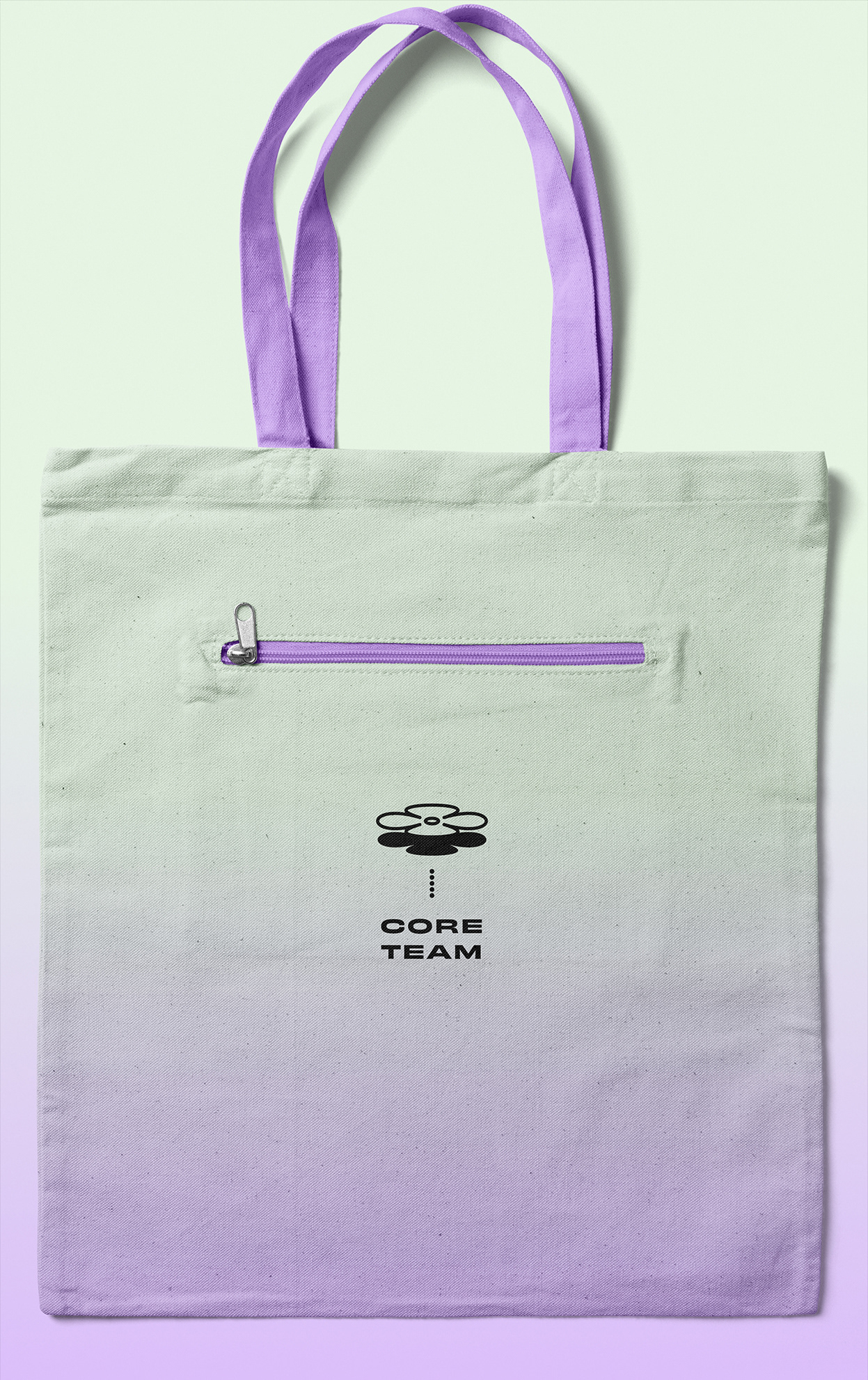
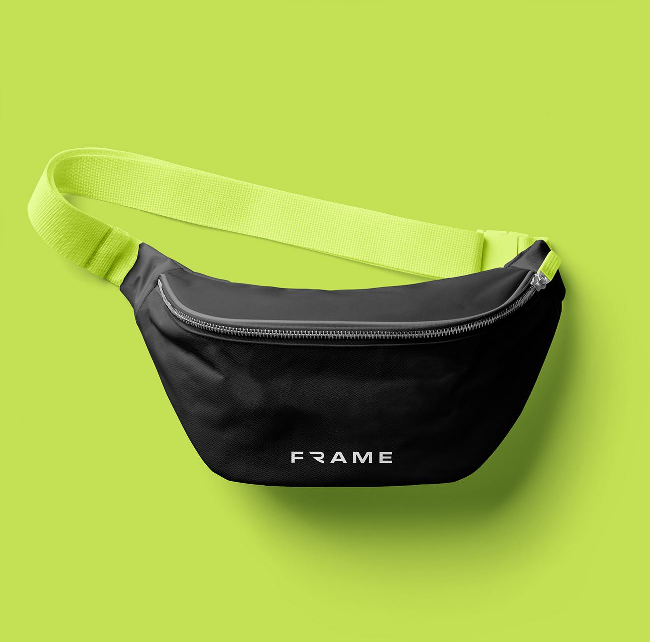
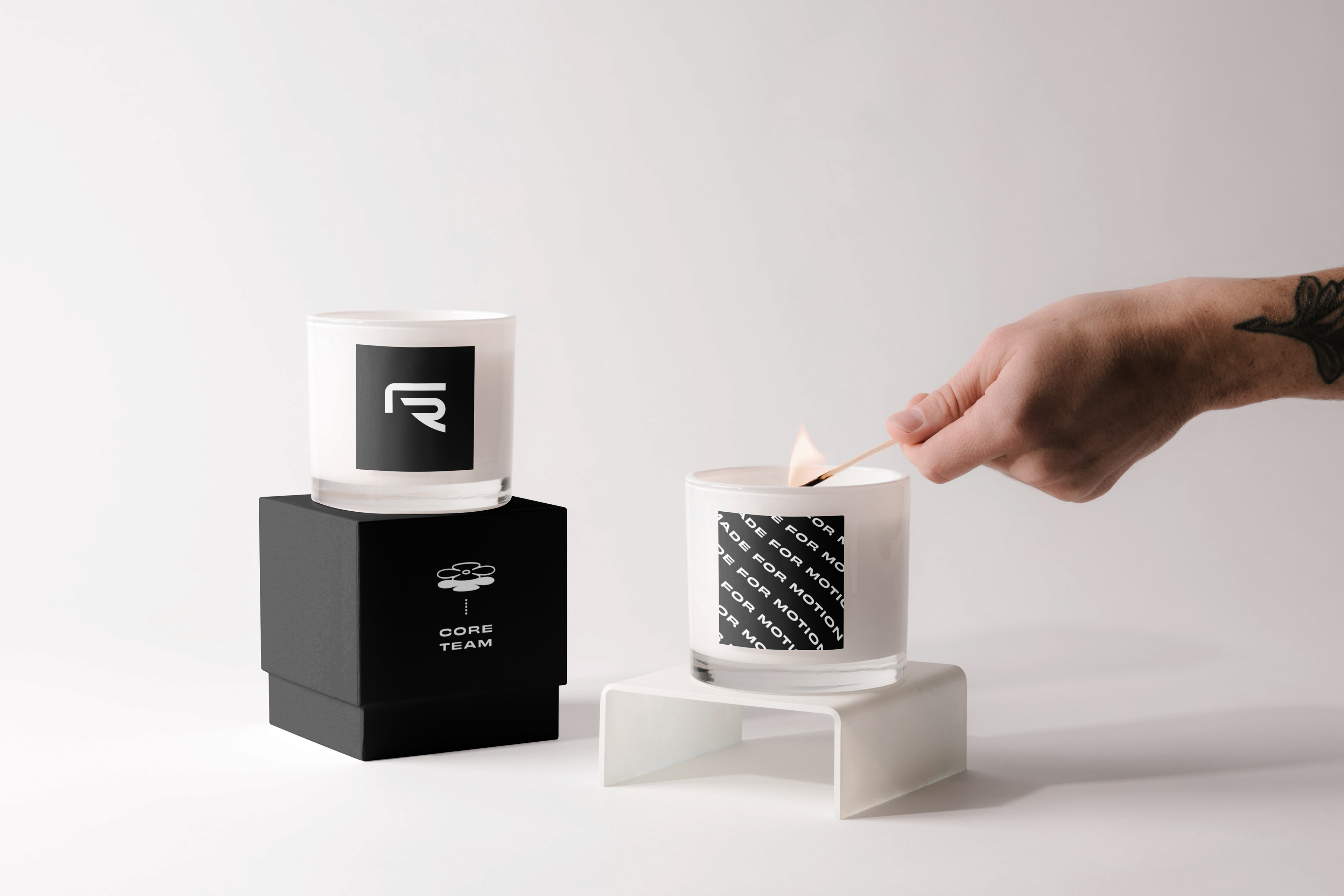
Finally, I developed a line of custom swag for users to proudly showcase the Frame logo. After all, is there better marketing than that?