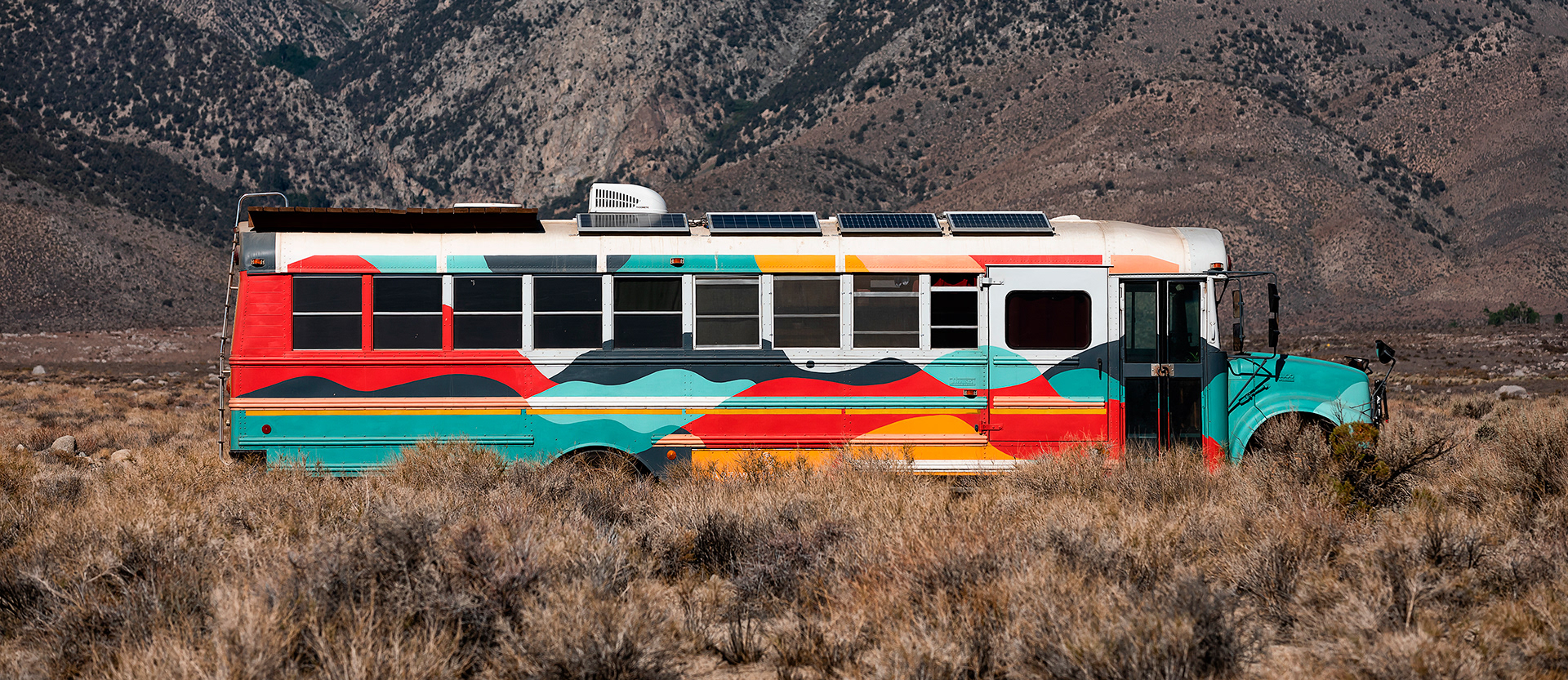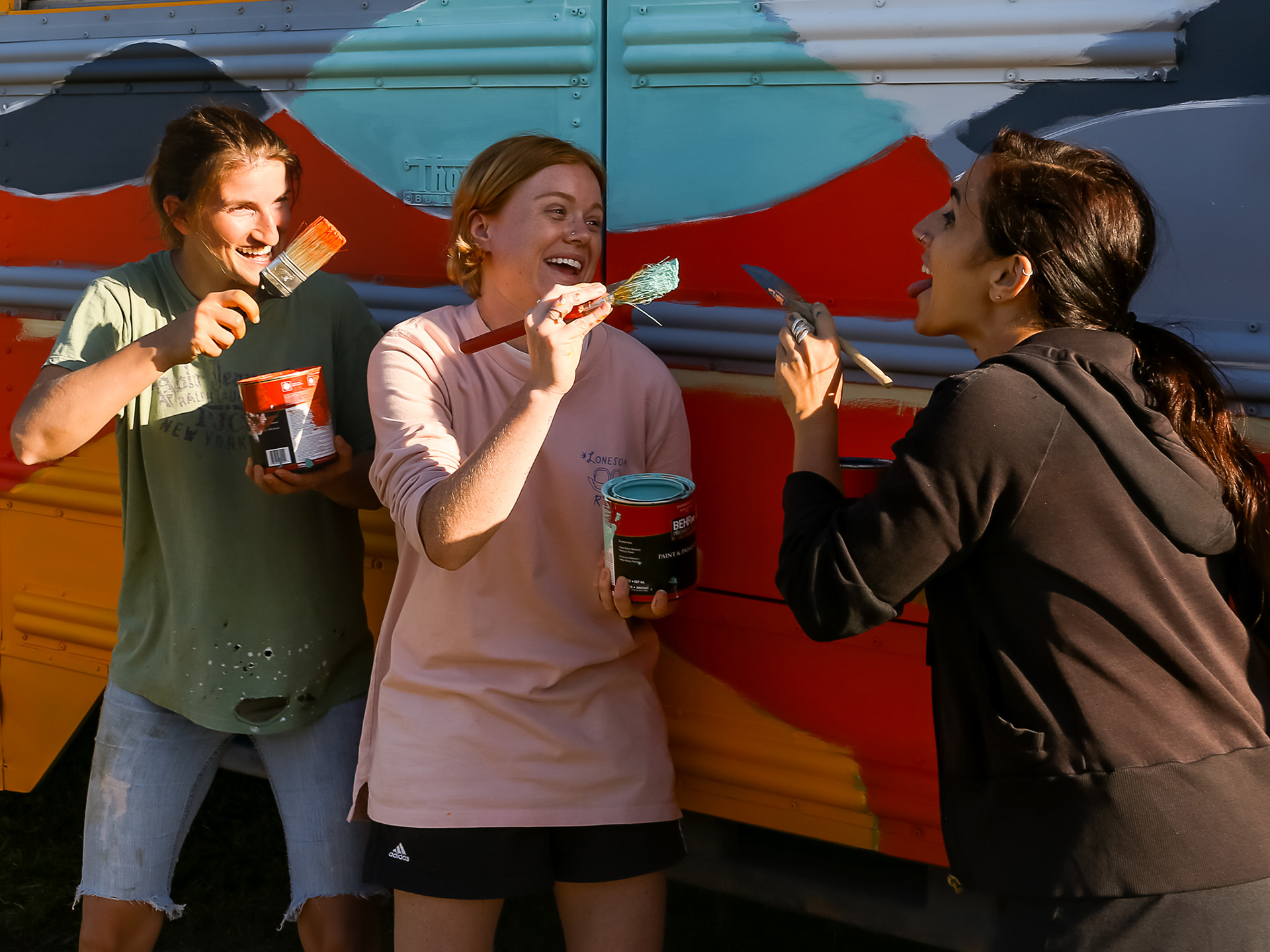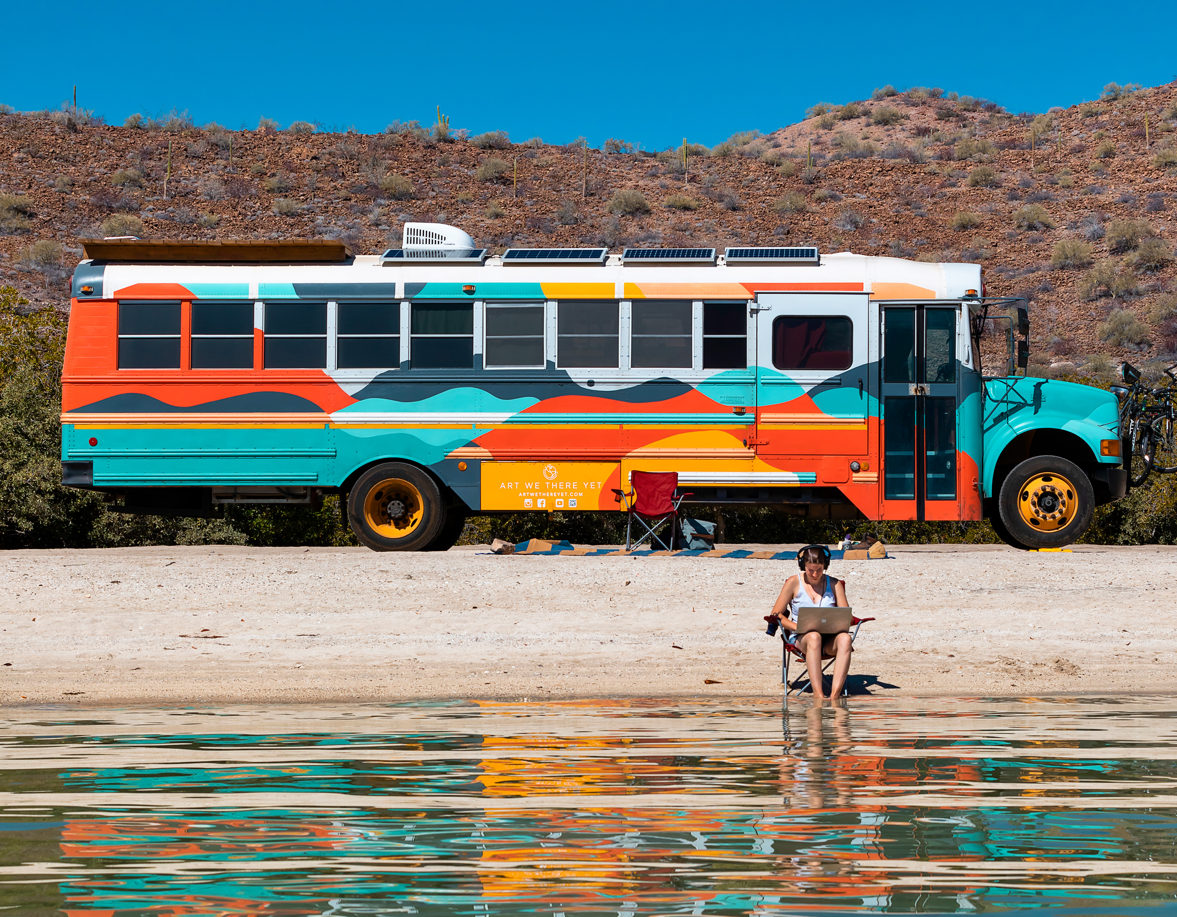
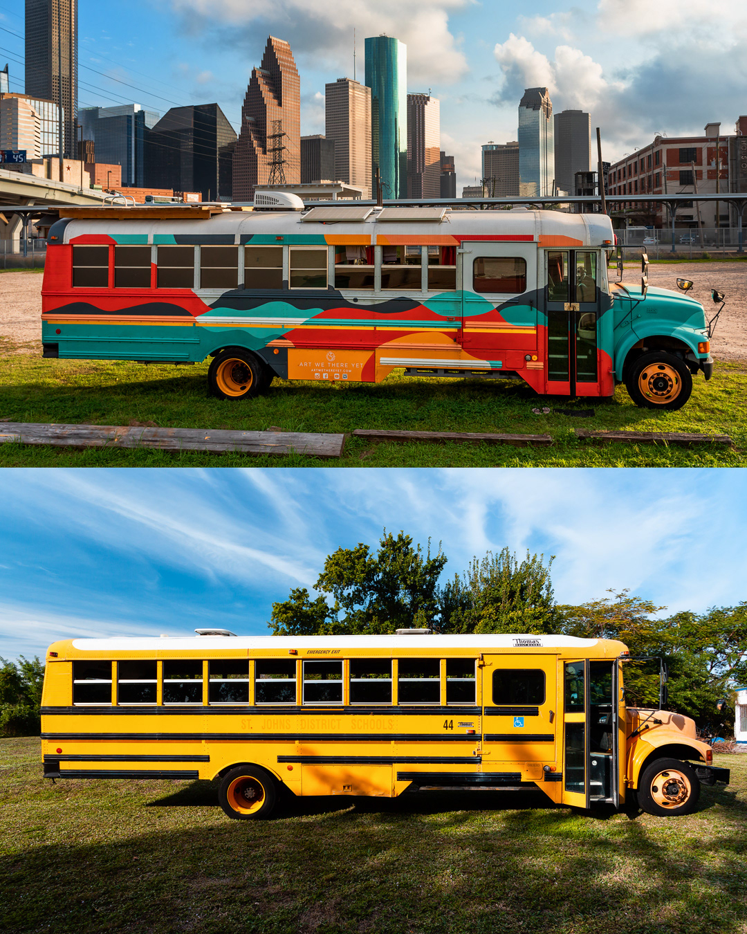
We designed something that would look beautiful against various backdrops as they travel through the Americas. Photos by José Vílchez. The concept for the mural was flow, and movement. It's an abstract representation of mountains, water, and sky.
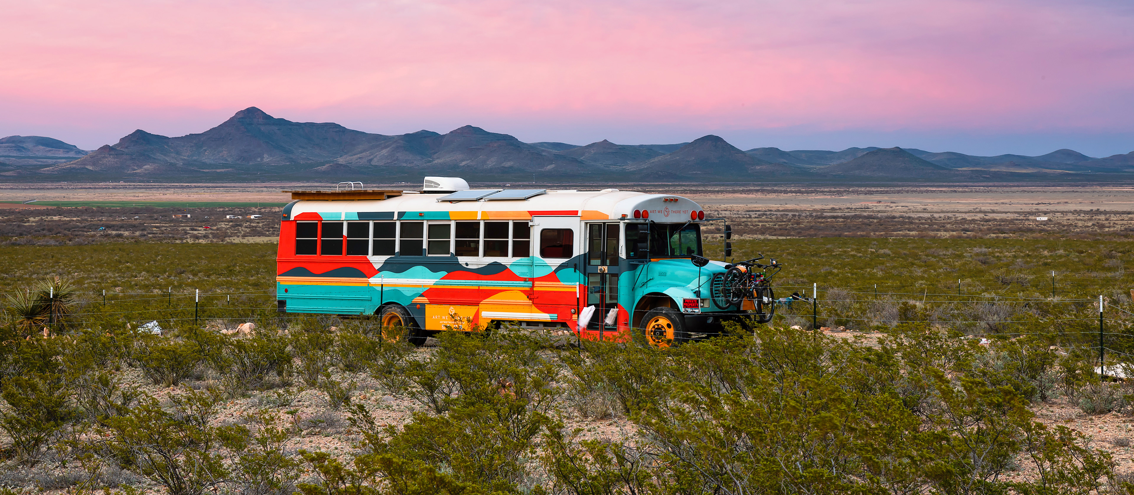
I wanted to mural to feel iconic and easily recognizable for the brand but also not overpower or set too much of a direction for the visual aesthetics of the programming. We wanted the mural to be inspirational and beautiful while also still feeling like it could be a backdrop for hundreds of projects around the world. The AWTY team uses the mural as a backdrop during musical performances, a space to have workshops, as a photography backdrop, and as a moving advertisement for the project. It somehow looks cohesive and impactful in every space.
Logo Mark
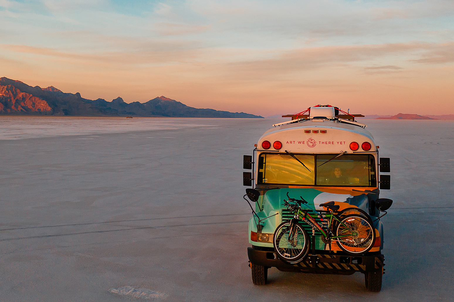
Additionally, they asked me to help with branding which you can see on the front of the bus (this was the hardest part to paint!). The mark shows the bus route of North and South America as a single thread representing the way that the project connects communities across the continents.